Take a peek at the new Google Play Store with Android L’s Material Design
Google won’t just bring a fancy new look to Android L this fall; the Play Store will also be getting a Material Design makeover of its own. And you don’t have to wait months to see it because the screenshots below provide an unofficial sneak peek at the Play Store’s changes in advance — complete with big and beautiful content banners and a cleaner UI.
Before you get down to the screenshots, bear in mind that they were pulled from a preview Play Store build, and that there’s a definite possibility further design changes will be made before Android L makes its public debut this fall. The Play Store’s overhaul is far from complete yet, but it’s certainly getting there.
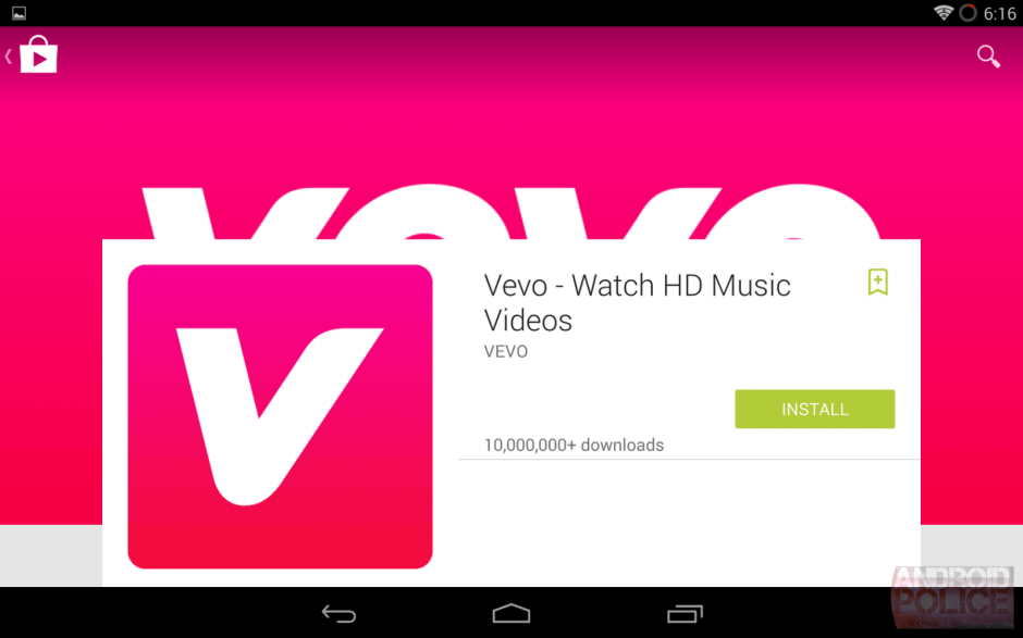
The biggest changes so far are to product listings, and they’re most evident in the Play Store’s tablet interface. Content cards with prices, descriptions, and artwork sit atop huge promotional banners, making individual listings simpler and more attractive.
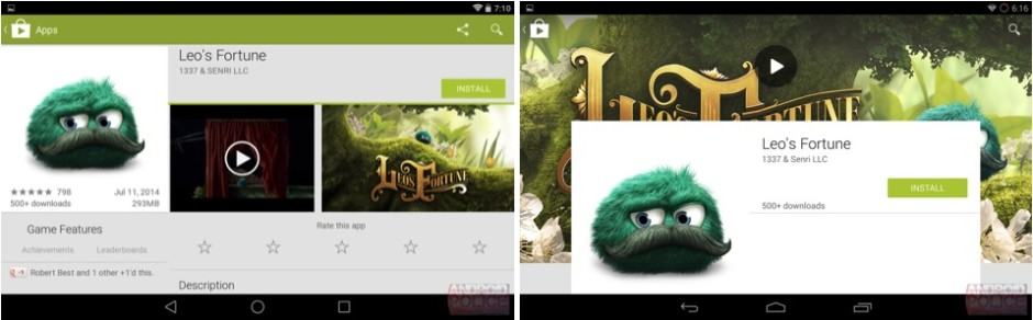
Here’s a sample for the popular platform game Leo’s Fortune. The existing Play Store design is shown on the left, while the new one is shown on the right.
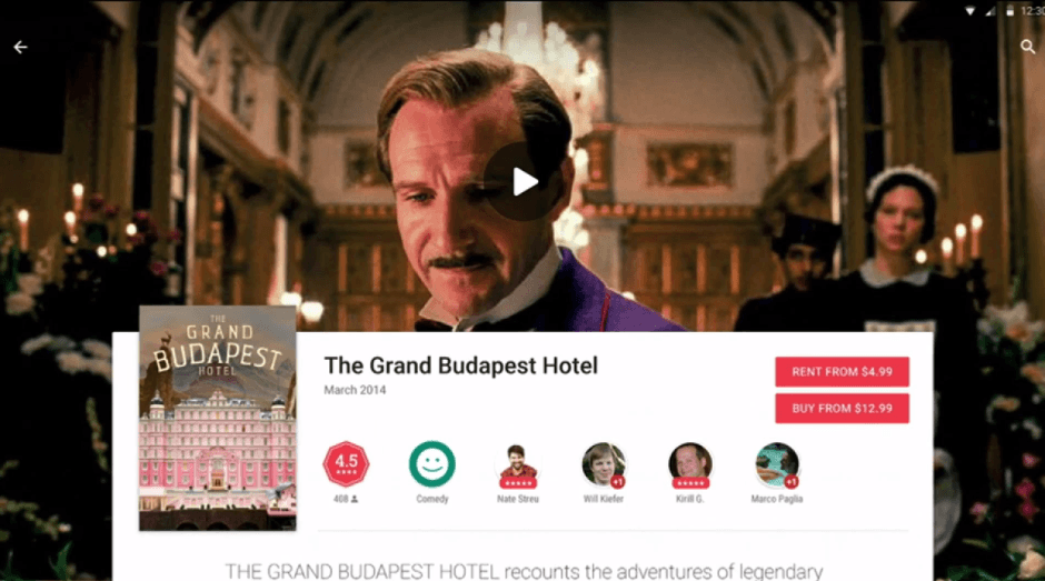
A listing for the movie The Grand Budapest Hotel, which was shown off at Google I/O back in June, shows that ratings, categories, and recommendations by friends will also be displayed in the new content cards. It also shows that Google will use a larger, lighter font for product descriptions.
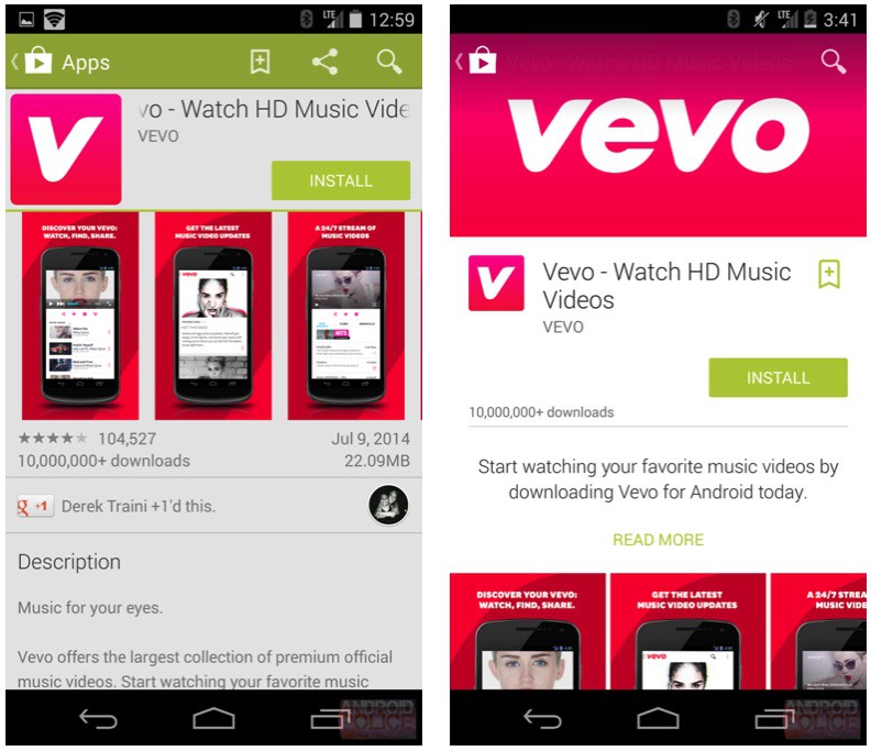
Here’s a comparison that shows how the Play Store interface has changed on smartphones. The screenshot on the left shows the existing design, while the one on the right shows the new one.
Once again, this is an early build of the new Play Store, so things are likely to change before the public release rolls out this fall. To view more screenshots of the new design, check out the original report from Android Police by following the source link below.
- SourceAndroid Police

