Cyanogen Cid Replaced By Fancy New Logo

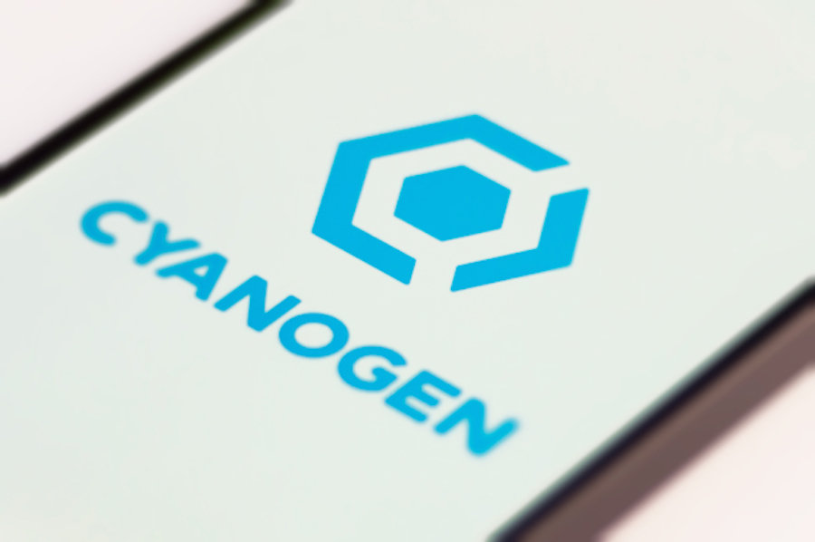
Cyanogen Inc., the company responsible for the immensely popular CyanogenMod ROMs, today revealed its new logo.
Seen above, the logo is designed to represent the three hallmarks of CyanogenMod, and it replaces the lovable CyanogenMod mascot, Cid. But don’t worry — his creators say we’ll still see him around.
“As a company grows, its brand must evolve to meet that need,” Cyanogen explained on its blog. “The brand should continue to embody the spirit of the company origins, but also speak to the future. The company’s new logo is the vehicle to showcase that brand.”

Cyanogen’s new logo isn’t just an arbitrary shape; it was designed to represent CyanogenMod’s open-source roots, its focus on security, and the very heart of its focus, customization. It also aims to evoke “the concept of tools and building; the tightening of screws as you put together a project.”
It’s a modern logo that fits the technology of today. It’s clean and it’s simple — a perfect representation of the CyanogenMod ROMs that will wear it.
But don’t think you’ve seen the last of Cid. Cid lives on, and he’s “stronger than ever,” Cyanogen says. “Cid belongs to the community, he is yours, not the company’s.”

What do you think of Cyanogen Inc.’s new logo? Let us know in the comments.
- SourceCyanogen


