Android’s design guru says iPhone interface is ‘heavy and burdensome’
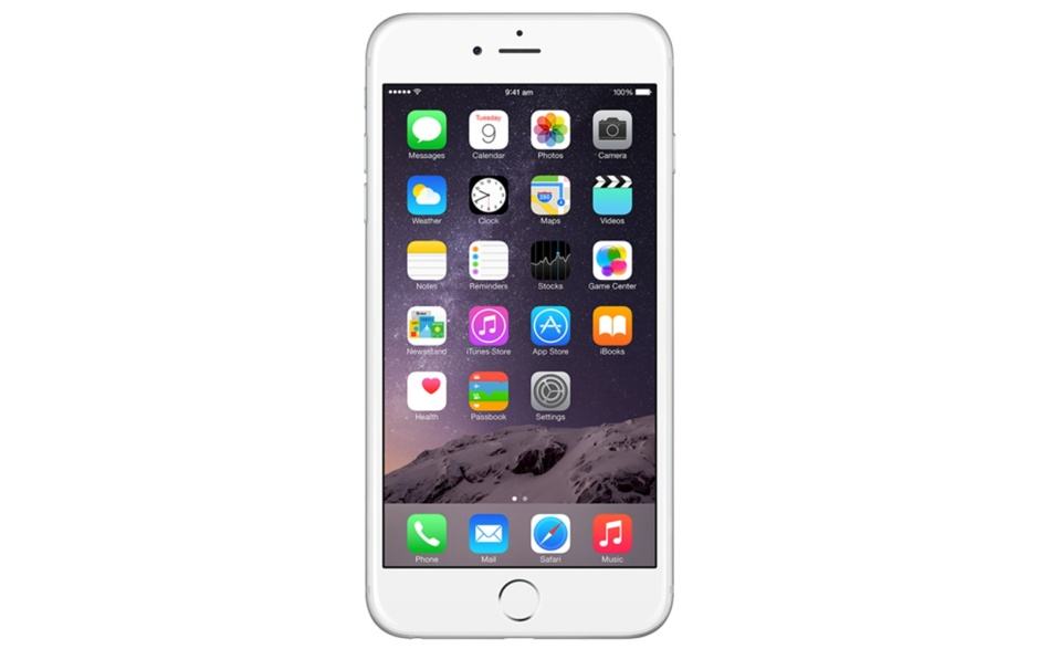
Damn that easy-to-use grid of apps! Photo: Apple
The arrival of the original iPhone may have fundamentally changed Google’s plans for its Android smartphone platform, but according to Google’s Vice President of Design, Matias Duarte, Apple’s iOS layout — consisting of grids of apps icons — is disappointingly stagnant.
“[The iPhone] crystallised a lot of other things that were kind of stayed even by that point,” Duarte told Wired in an interview, “like the rows of icons, which don’t scale very well. This idea of a tiny grid that you manually curate starts to feel very heavy and burdensome.”
“It’s easy for things to settle on standards that are sub optimal,” he says elsewhere in the article. “Its very [easy] for things to catalyse into local maxima that are hard to break out of.”
Duarte doesn’t suggest an alternative to Apple’s mobile design, but says that “phones are starting to show their age,” suggesting that we’re on the cusp of the next big leap in mobile computing.
Unfortunately for Google, its own attempts at bringing about this change (Google Glass being a prominent one) haven’t exactly come to much. Whether or not this will alter in the near future remains to be seen, but for now it seems that we’re stuck with grids of apps — something which, I should point out, I’ve never found particularly “burdensome” to deal with.
Does Matias Duarte have a point, or is this an unnecessary shot at Apple? Leave your comments below.
Source: Wired
Via: BGR

