A look at the Android L Developer Preview on the Nexus 5
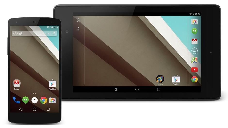
It has just been over a couple of weeks since Google released the Android L Developer Preview (DP) for the Nexus 5 and Nexus 7 (2013). While I was initially hesitant, I ultimately took the jump and flashed the developer preview on my Nexus 5, which is also my daily driver.
Below are my thoughts on the OS and whether you should take the effort of installing it on your Nexus device or not.
The initial boot and setup process
The first thing that I immediately noticed after flashing the Android L Developer Preview factory image was the extremely long boot time. Even with a clean wipe and zero apps installed, the first boot easily took more than 5 minutes. The reason behind this can be attributed to the new runtime — ART — introduced by Google in L, which actually pre-compiles all the app’s code instead of compiling them when the app is actually started.
While this does lead to a visible performance boost in apps, it negatively effects the boot time. I hope Google is further able to improve ART and reduce the initial time taken to boot, otherwise many Android users will think that they have bricked their device.
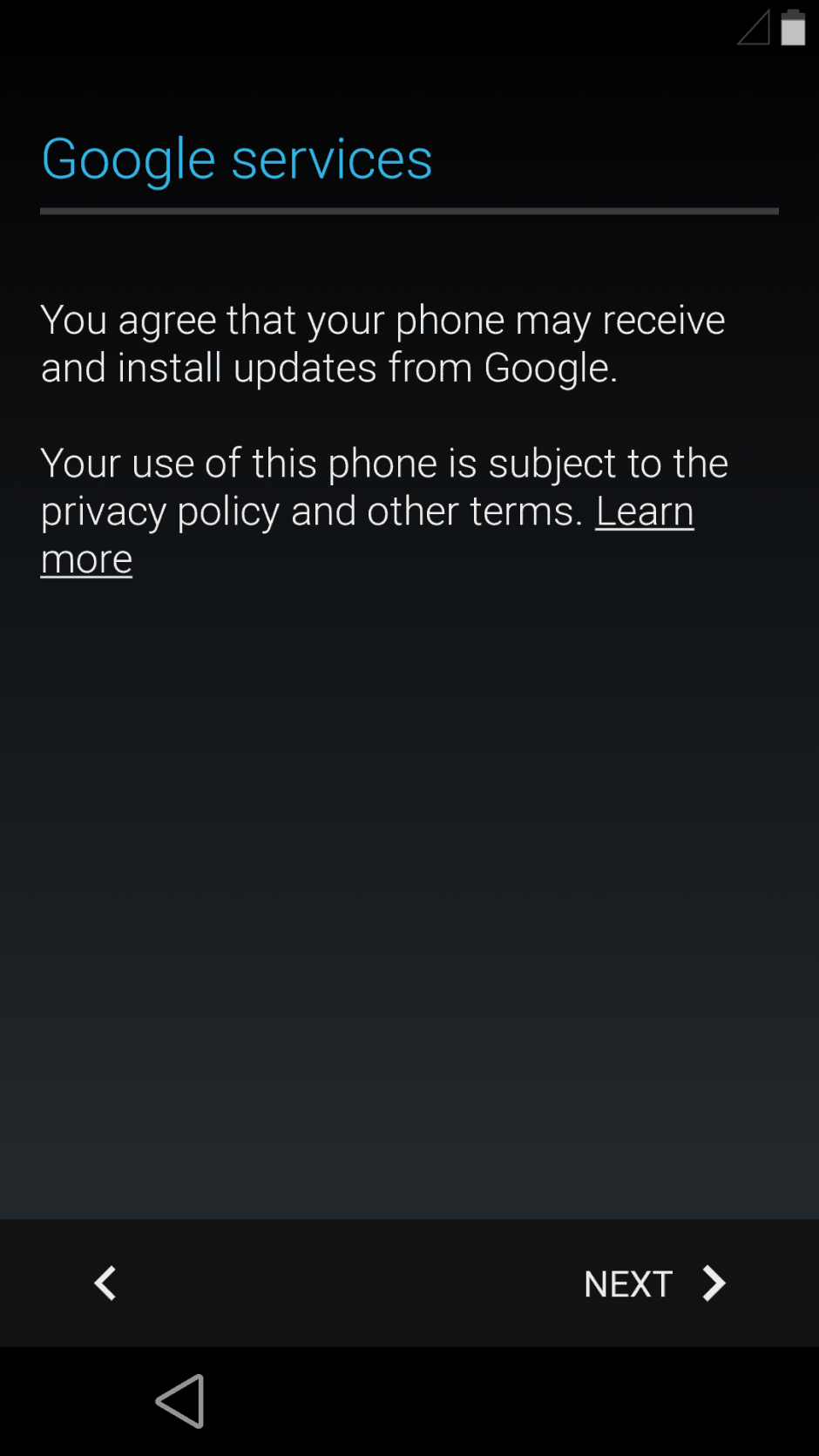
The initial setup process remains largely the same with only some slight visual tweaks from Google. The new Material Design, however, is clearly visible with a solid grey background and the flatter looking UI elements.
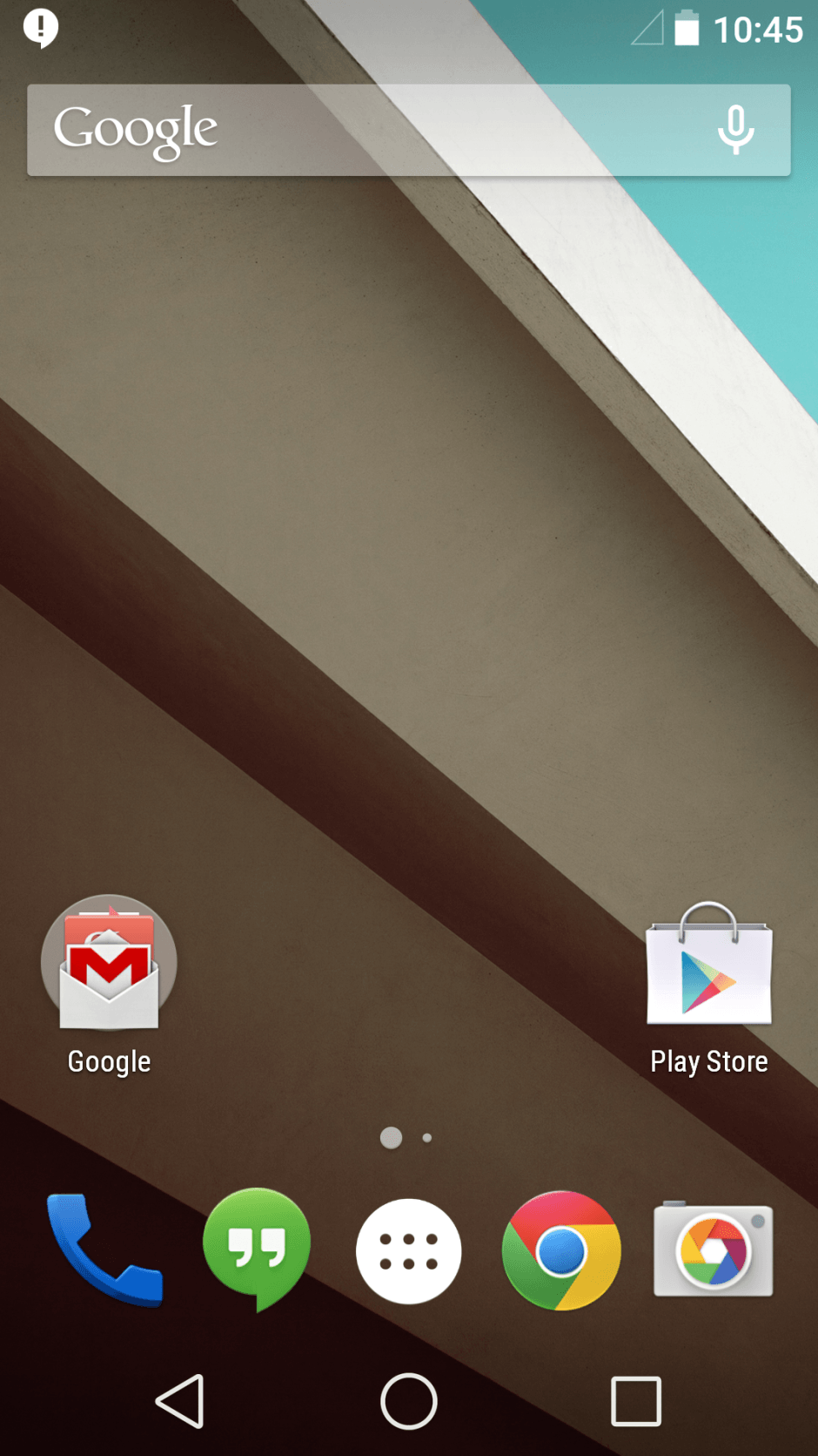
Once you are done with the initial setup process, you will be greeted with the familiar looking Android homescreen. There are no major visual overhaul here with Google only tweaking a few icons including the ones on the navigation bar, where a triangle represents the back button while a circle represents the home. The initial feedback about these icons have been generally negative so it will be interesting to see if Google pays heed to user feedback and tweaks them in the final release of Android L.
The new notification bar & lock screen
The new Material Design introduced by Google has left no area of the UI untouched including the notification bar, which has also received some slight functionality tweak. New notifications are now displayed in a card like design and allow users to directly interact with them.
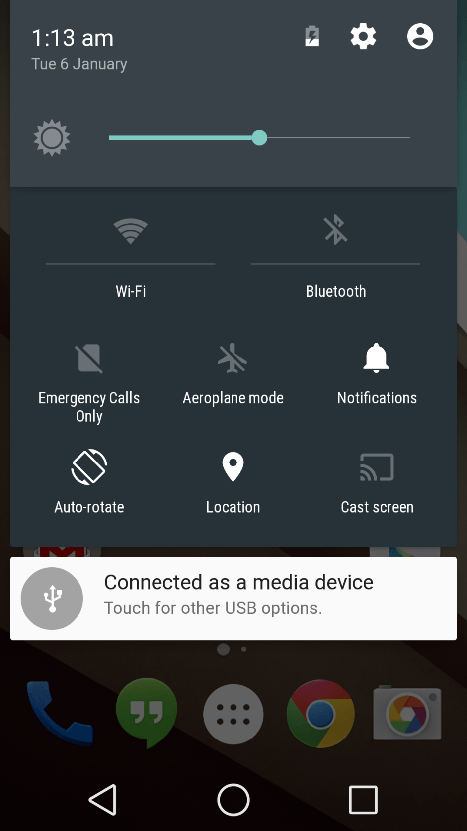
The new Quick Settings are accessible with another pull from the top with the notification bar already opened. The two-finger swipe down gesture from the top does not work anymore in Android L but one can hope that Google re-introduces it in the final build. The new tiles in QS are actually toggles now and allow users to directly enable or disable some commonly used functions like Wi-Fi, Bluetooth and Auto-Rotation (Yes, finally!).
The lockscreen has received a pretty major overhaul in Android L and can now also display notifications without requiring users to swipe down the notification bar. With the option enabled, the lockscreen almost feels like an extension of the notification bar itself, since it also allows users to expand and interact with the notifications right from the main screen.
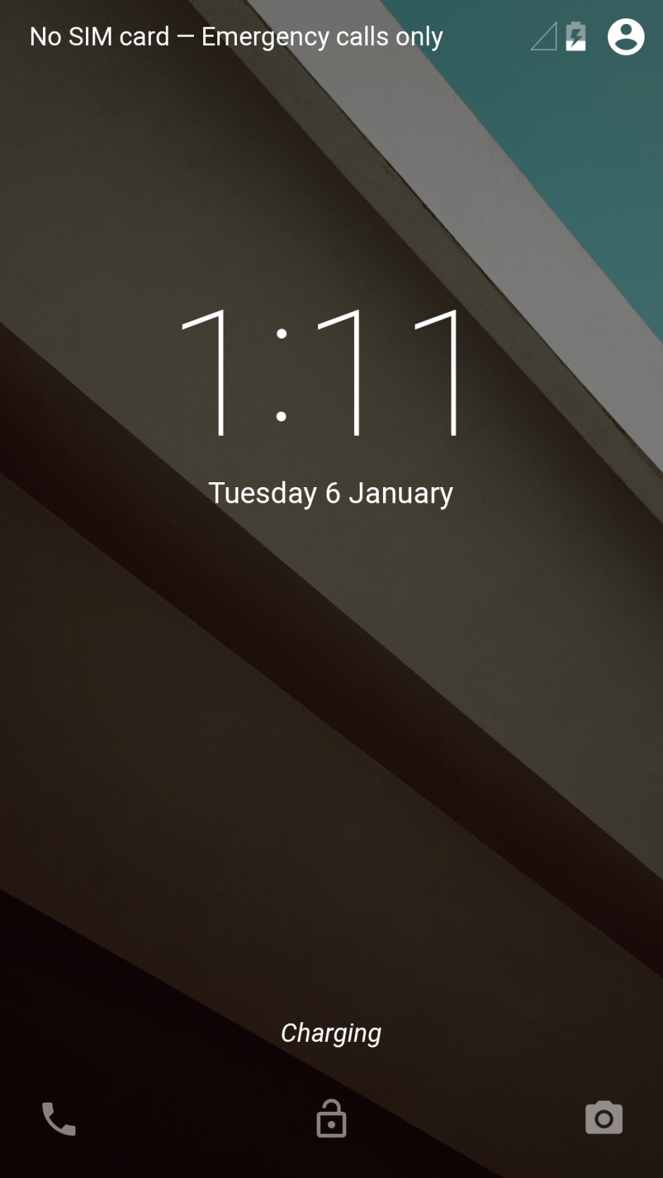
Google now also allows users with quick access to the Phone app via a swipe to the right along with the Camera app, which can be accessed via a swipe to the left. Lockscreen widgets are missing from the Android L Developer Preview but it is not yet confirmed whether they will return in the final build or if they have been killed once and for all.
The new animations, icons and font
Google’s new Material Design theme includes not only a new UI and UX but also new system-wide animations. Nearly every aspect of the UI has a new fluid animation, something that even KitKat lacked in certain places. There is also a new rubber band animation when the user reaches the end of a list. The new Roboto light font also plays a major role in giving Android L a fresh new look and blends in perfectly with the new Material Design.
Android L is also going to come with a new set of icons but not all of them are included in the Developer Preview. This is because most of the Google Apps are updated directly from the Play Store and Google, understandably, does not want to update their icons right away.
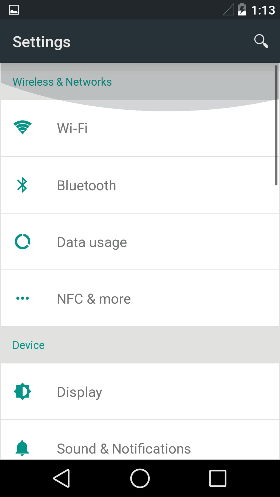
Jumping into the Settings menu and scrolling up and down within seconds of the phone booting from a fresh factory install was super smooth, no matter what I did. Even after installing all the apps and setting everything up just the way I like, my Nexus 5 always felt super-smooth. After multiple updates, Google has finally managed to catch up with Apple in terms of UI performance.
The only time there was a hint of lag was while apps were being installed in the background and I was trying to browse through the system or an app.
Why you should not use Android L as your daily driver yet
I was using the Android L Developer Preview on my Nexus 5 since the day it was released by Google but finally decided to flash back to KitKat last weekend. This is mainly because of the random bugs present throughout the OS which can get irritating especially when you face it on a day to day basis.
Another major issue is with some third-party apps not working properly in Android L. While the number has gone down drastically over the last couple of weeks, some popular ones like Viber, Plex and Dropbox are still not working properly, which is a bummer.
Plus, since most of the apps follow the Holo guidelines, there is a stark UI differences between them and Android L, which leads to a very inconsistent user experience.
Until and unless you are a developer or a die-hard Android enthusiast, there really should not be any reason for you to run the Android L Developer Preview on your Nexus 5.

